The Chow Down
UI • BRANDING
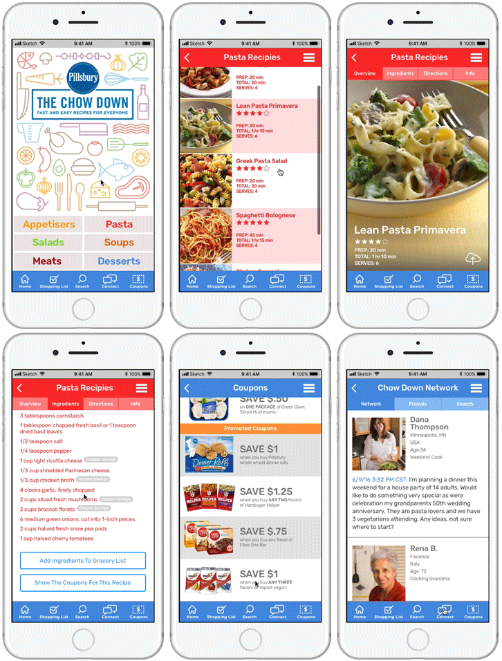
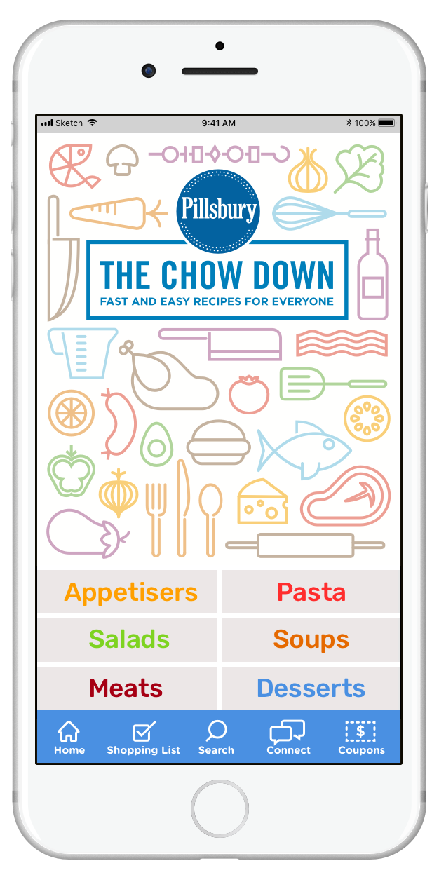
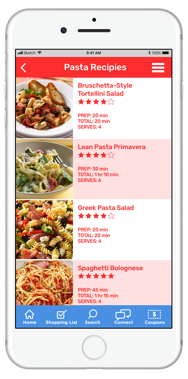
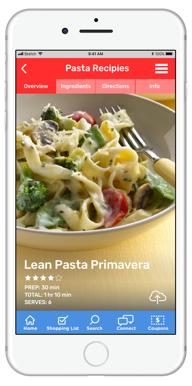
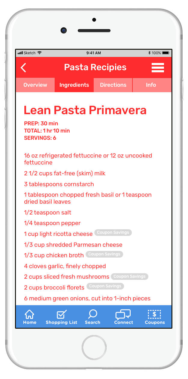
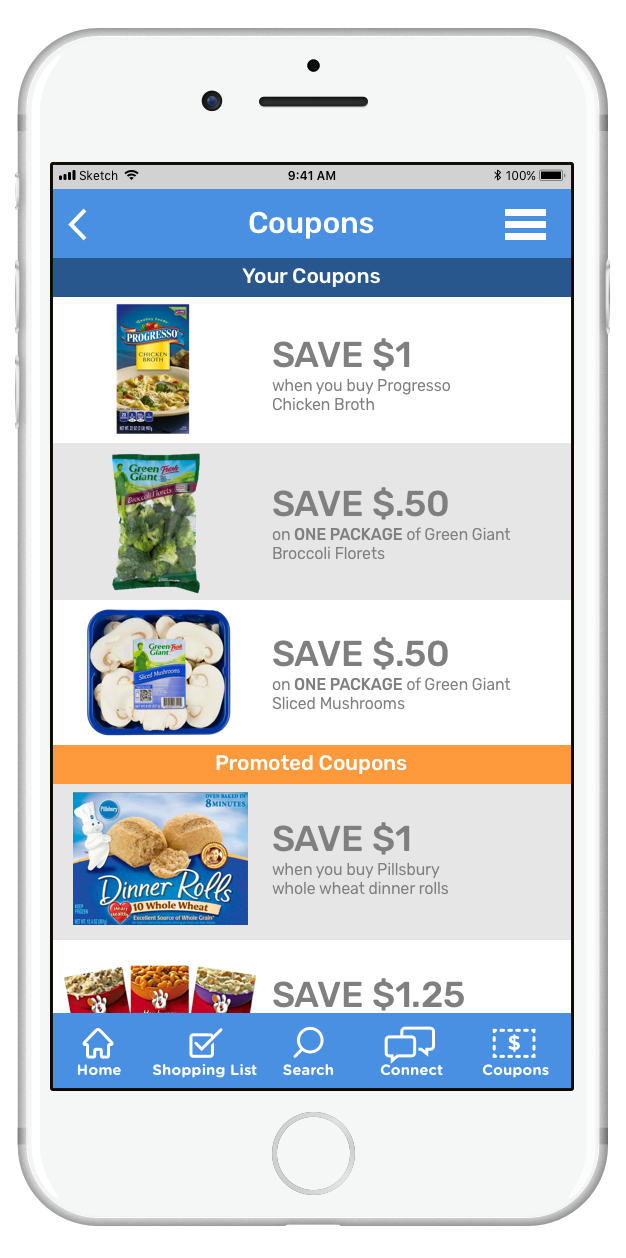
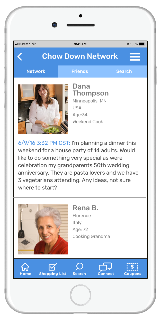
Due to declining sales, Pillsbury was looking to reposition the marketing of their checkout counter recipe books. From a UX standpoint, they were positioned at the wrong end of the user journey - people would see them at the end of their shopping experience after they were already done shopping and had their ingredients for a meal. With this thought, the user needed to have an idea of what they wanted to make at the beginning of the user journey. The most logical solution was to create an app, where the user could find a recipe and the ingredients with incentivizing coupons for those ingredients. The user could also see how others rated the recipes or get ideas for meals from a social networking component in the app as well.


